Redesigning and Rebranding TV Smart Across Web, Mobile, and TV

Organisation
PLEJ
Role
Product Designer
Duration
1 Year & 2 Months
Tools & Technologies
Figma
FigJam
Hotjar
Maze
Problem
The brand no longer matched where the product was heading, and years of incremental changes had left the experience inconsistent across web, mobile, and TV. With watch time and subscriptions both riding on the redesign, the usability issues weren't cosmetic, they were quietly costing conversions.

My role
I owned both UX and UI across web, mobile, and TV, including the new brand's visual identity, working within a shared design system built from scratch so all three platforms spoke the same visual language and handoff to developers stayed predictable.
Outcome
Content discovery up 23%, session length up 12%, retention up 14% after launch.
How i solved it
We started with a kickoff, client stakeholders, developers, me, all in the same room before any design work began. From there I audited the existing service together with another designer, going screen by screen across web, mobile and TV, watching where people dropped out of signup and where navigation just stopped making sense once you swapped a mouse for a remote control. That early finding, navigation and search quietly failing people, became the thread we kept pulling on, and it's what eventually moved content discovery by 23% once the redesign shipped.
Those findings went into a second round of workshops, this time digging into what the business actually needed from the redesign. The brief had assumed one identical layout across three platforms would work, and it didn't hold, a remote control does not behave like a thumb on a phone screen. Giving TV its own navigation logic instead of forcing one layout everywhere is the decision that shows up most directly in the session length numbers, up 12%, because people stopped fighting the interface long enough to just watch something.
Only once the requirements were settled did I start on the design system, building the new brand identity into components first, so every platform had the same visual foundation before a single screen got drawn. Low-fidelity wireframes came next, then high-fidelity screens once the flows held up, benchmarked along the way against two direct competitors. That consistency across web, mobile, and TV is what I'd point to behind the retention number, 14%, people didn't have to relearn the product every time they switched screens.
Each stage went back to the client as a short presentation rather than a written report. The project closed with full handoff documentation and a working design system the dev team could build from without guessing at intent.


What worked
Auditing the service together with another designer before any design started meant the redesign was based on where things actually broke, not on assumptions. Investing extra time into annotating every component directly in Figma paid off fast: engineers stopped asking which button belonged where, because the answer was already sitting next to it, and that saved time compounded across all three platforms, not just one. The decision to give TV its own navigation logic, instead of forcing one layout across three platforms, turned out to be the right call once usability testing started: content discovery rose 23%, session length rose 12%, and retention rose 14% after launch.
What I'd Do Differently
Benchmarking landed in the middle of the process, somewhere between low and high fidelity, and by the time I saw how far behind our navigation and search really were, the second round of workshops, the one meant to nail down business requirements, was already behind us. If I'd run that comparison before those workshops instead of during design, the gap wouldn't have just shaped screens, it would have shaped what we asked the business for in the first place.
// Other works
Have a look at my other work
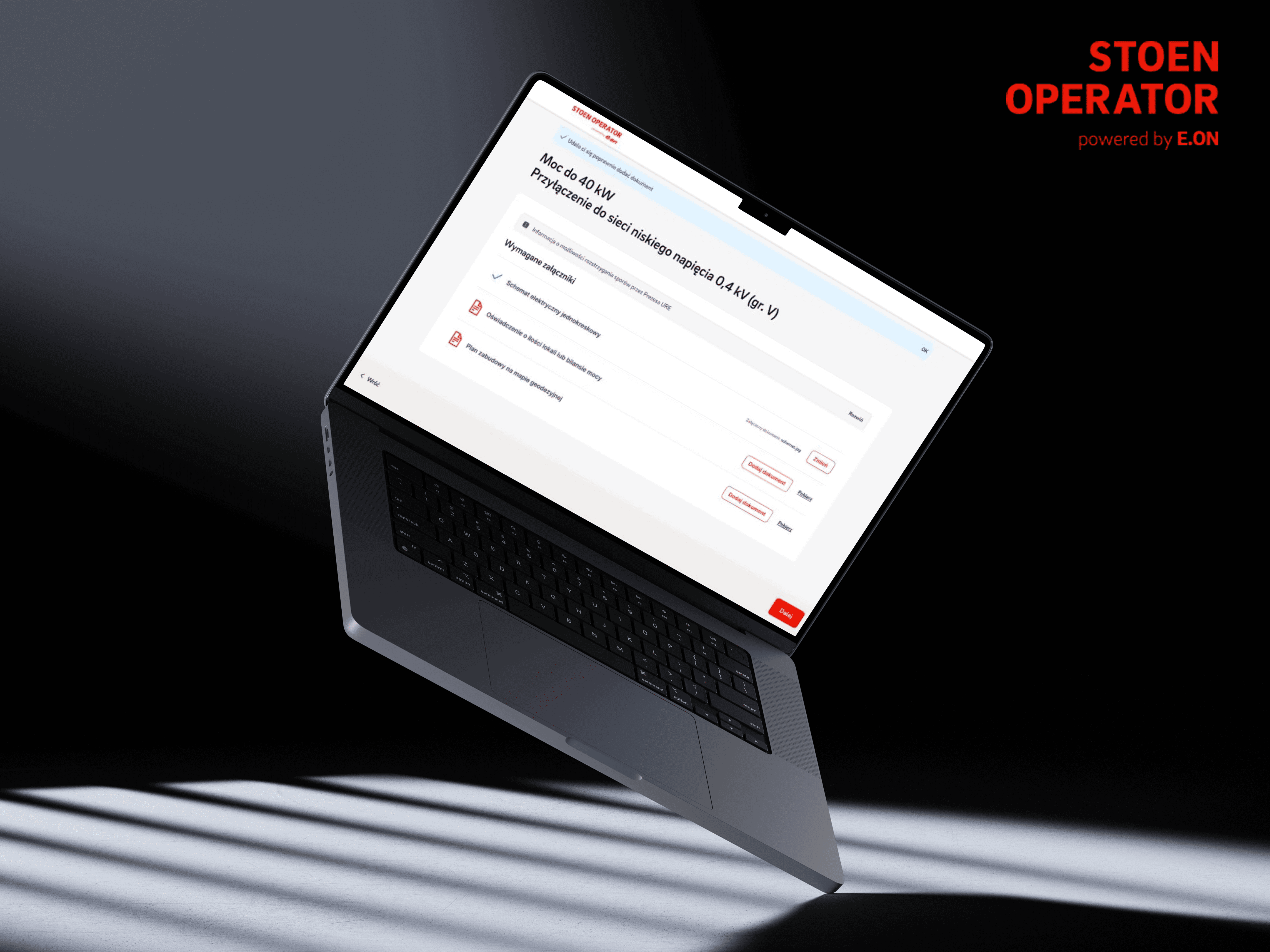
Merging Eight Application Paths Into One Flow
4 Months
2026
A grid connection portal where the site and the form lived like two disconnected places, and every case type had its own maze.

e-point
UX Designer

Redesigning the Website and Building a CRM for a Telecom Provider
1 Year & 1 month
2025 - 2026
Sales reps were piecing together customer history from scattered notes, while the public site couldn't explain the offer clearly enough to convert.

4 o'clock
Product Designer


@Michal Mendrek 2026