Redesigning the Website and Building a CRM for a Telecom Provider

Organisation
4 o'clock
Role
Product Designer
Duration
1 Year & 1 month
Tools & Technologies
Figma
Maze
Miro
Problem
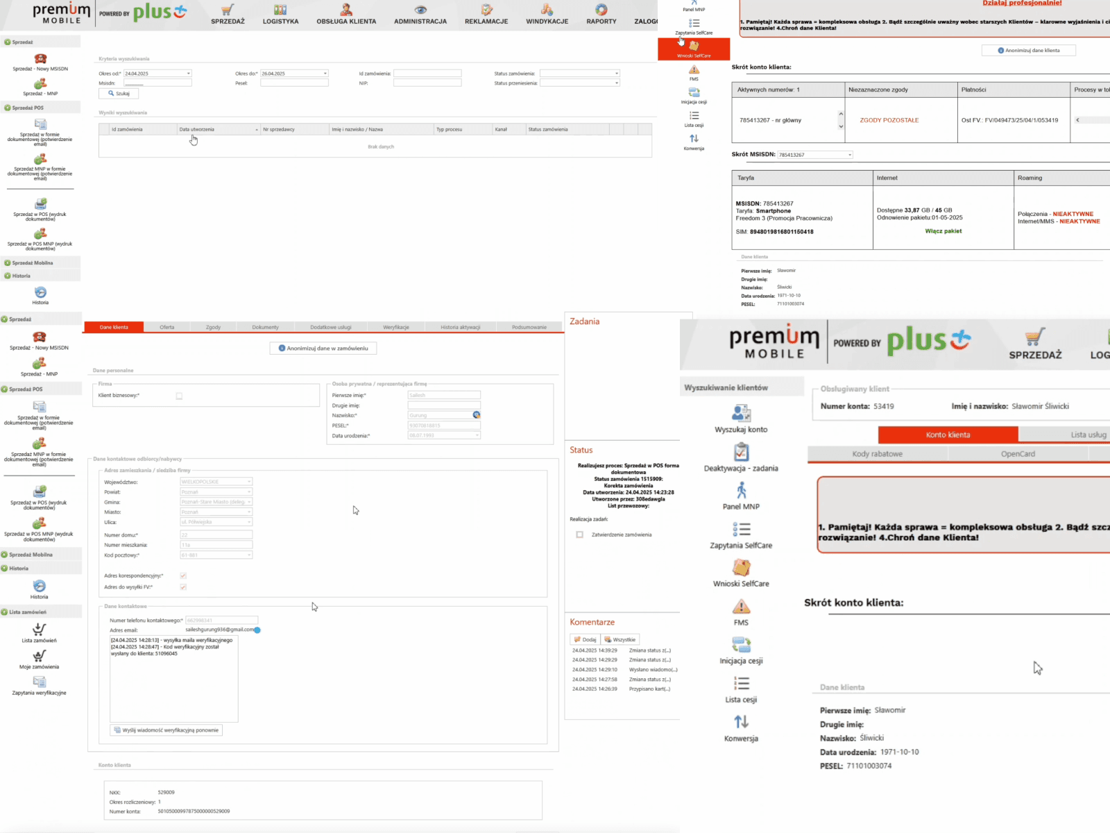
The existing website made it hard for visitors to understand the offer, and that confusion was quietly driving people away before they ever left contact details, the kind of leak that later showed up as a 30% drop in exits once fixed. Behind the scenes, sales reps were resolving customer inquiries by hand with no system built for it, work that would eventually get 40% faster once a real CRM existed. The two problems fed each other: a confusing site generated more inquiries than an unsupported team could handle, and neither side could improve without fixing the other.

My role
I worked end to end alongside two other designers, from kickoff through a mini design system and light branding work, to final UX and UI mockups and client workshops.
Outcome
Site exits down 30%, lead volume up 22%, CRM task time down 40%.
How i solved it
The project kicked off with the client, developers, myself and two other designers, everyone in one room before anything got drawn. From there we ran user interviews, task analysis, and a competitive benchmark against other telecom sites, trying to understand why visitors weren't converting into leads. The site's structure and messaging were the first thing we rebuilt, cutting the offer down to what people actually needed to see before deciding. Rather than launching everything at once, the redesign and the new offer went out in three stages, each one building on what we learned from the last before touching the next part of the site.
Workshops with the client came next, this time focused on the CRM side, mapping how sales reps actually handled inquiries day to day rather than how the process was supposed to work on paper. That gap between the two was wide, reps were piecing together customer history from memory and scattered notes across different tools.
Alongside the functional work, the three of us built a mini design system and a light branding refresh, enough to keep the website and CRM visually consistent without turning it into a full rebrand. High-fidelity mockups followed for both, tested through usability sessions before handoff.

What worked
Running the site redesign in three stages instead of one big launch meant each phase could actually learn from the last, by the time we touched the final section of the site, the messaging patterns that worked were already proven, not guessed at. Splitting attention between the public site and the internal CRM in parallel, rather than finishing one before starting the other, kept both teams' feedback flowing into the same design system instead of two disconnected efforts.
What I'd Do Differently
The CRM workshops happened after the site work was already underway, and by then some of the site's messaging decisions were already locked. Running both workstreams in parallel from day one would have let the offer language be shaped by what reps were already hearing from customers, instead of the two meeting in the middle later than they needed to.
// Other works
Have a look at my other work
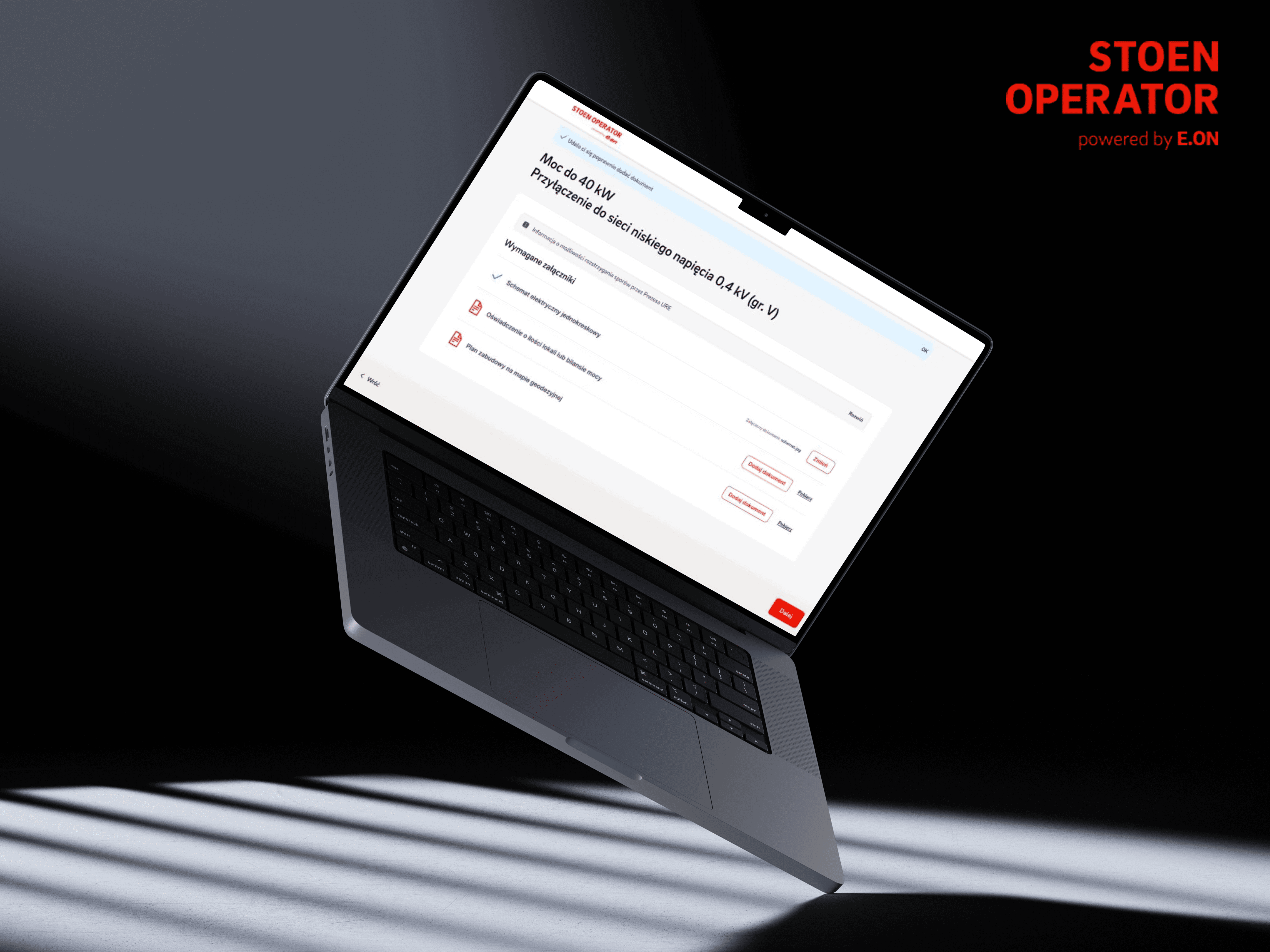
Merging Eight Application Paths Into One Flow
4 Months
2026
A grid connection portal where the site and the form lived like two disconnected places, and every case type had its own maze.

e-point
UX Designer

Redesigning and Rebranding TV Smart Across Web, Mobile, and TV
1 Year & 2 Months
2024 - 2025
A streaming platform on an outdated brand, with web, mobile, and TV that never quite felt like the same product.

PLEJ
Product Designer


@Michal Mendrek 2026