Merging Eight Application Paths Into One Flow
Organisation
e-point
Role
UX Designer
Duration
4 Months
Tools & Technologies
Figma / FigJam / Figma AI plugins
Claude
Dovetail
Problem
The portal showed the same problems across almost every case type: forms and attachment lists that revealed everything at once instead of adapting to what the client had actually selected, status communication that leaned on text instead of visual cues, sometimes clashing with the brand's own color used for alerts, and technical jargon, installed versus connection power, long legal quotes as field labels, dropped into the interface without explanation. On top of that, the homepage and the application process lived like two separate products, leaving people to guess how to get from one into the other. Checklista: Junior, pokryte: business goals nazwane pośrednio przez konsekwencje (użytkownik gubi się, nie rozumie), konkretne przykłady zamiast ogólnika


My role
UX Designer on the audit and redesign, coordinating with e-point and Stoen's IT team to keep the new flow aligned with backend constraints.
Outcome
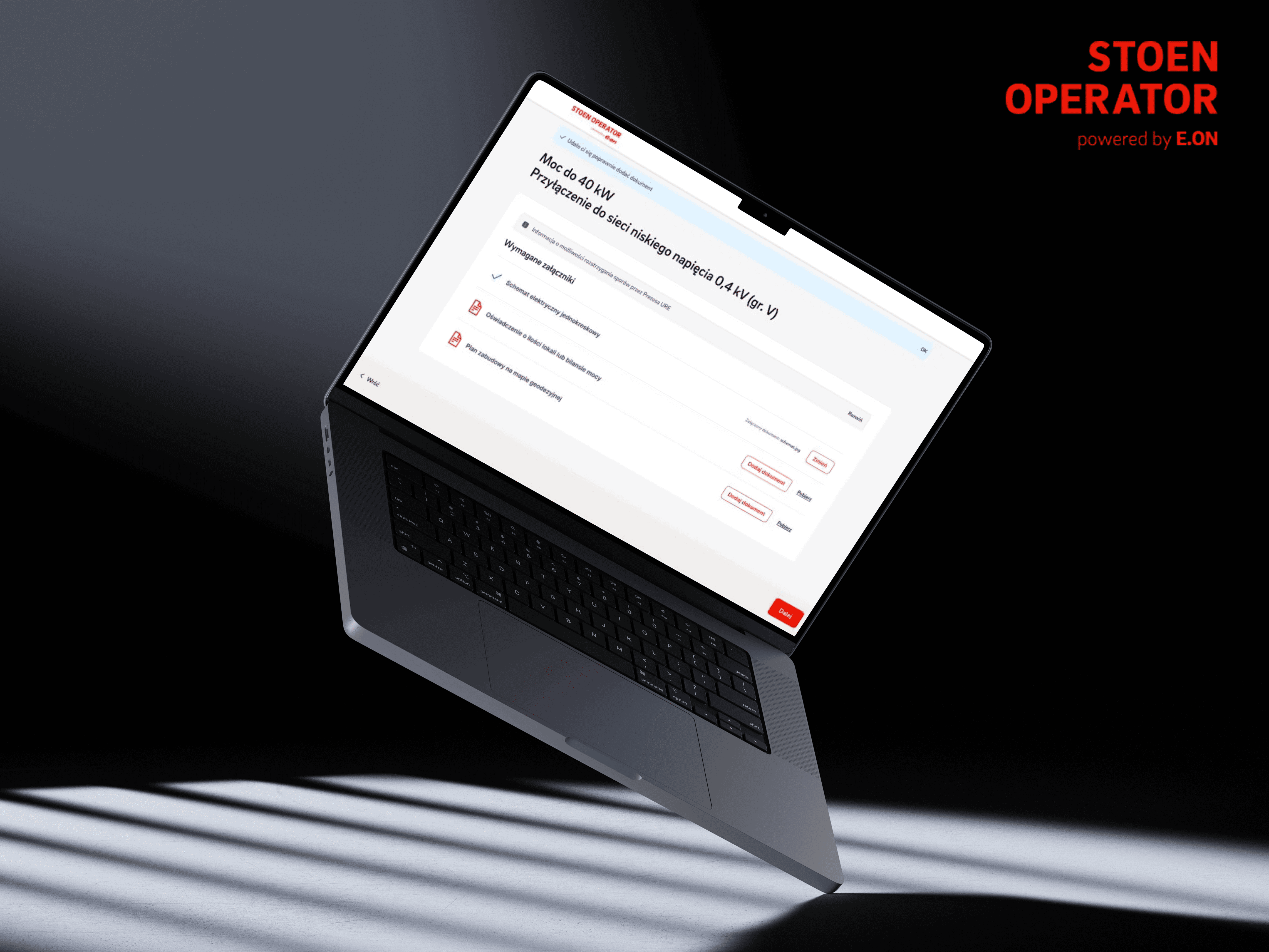
A unified journey from the operator's homepage into the application process, with a consistent 6-step flow covering all 8 case types.
How i solved it
The project ran as a Foundation phase built around four client workshops paired with four design sprints, not a single linear pass through research and design. Each workshop surfaced a slice of the current problems, jargon nobody outside the business understood, statuses that didn't match what BPM actually tracked, forms that dumped every field on the client regardless of their case, and immediately confronted it against business priorities in the room, instead of writing it up for a meeting two weeks later.
Between workshops, the corresponding design sprint took the friction points from the room and turned them into work: a full audit of the existing portal, case type by case type, then benchmarking against competitors both in energy and outside it, to see how other industries solved the same progressive-disclosure problem. Findings from each sprint fed directly into the next workshop, so the client was reacting to something concrete every time, not to an abstract plan.
Synthesizing four workshops' worth of notes fast enough to keep that rhythm going was its own challenge, and this is where I leaned on Claude to help structure raw workshop output into patterns I could act on between sessions, instead of losing days to manual note-sorting. Based on the accumulated audit and client feedback, the target flow came together last: a single six-step path covering all eight case types, with the homepage and the application finally reading as one journey instead of two.

What worked
Presenting the audit findings back to the client as structured recommendations, not just a list of problems, gave every suggestion something to stand on when it got questioned in the room. Defending those recommendations directly, case type by case type, meant the target flow wasn't just what I thought looked cleaner, it was shaped by what the client actually needed to see change and why, argued through rather than handed over.
What I'd Do Differently
Communication with the wider team could have been tighter, especially the handoff to development. I'd take more ownership of that transition instead of treating the design phase as finished once the flow was approved, working closer with engineering earlier to make sure what got built matched the intent behind the flow, not just the screens.
// Other works
Have a look at my other work

Redesigning and Rebranding TV Smart Across Web, Mobile, and TV
1 Year & 2 Months
2024 - 2025
A streaming platform on an outdated brand, with web, mobile, and TV that never quite felt like the same product.

PLEJ
Product Designer

Redesigning the Website and Building a CRM for a Telecom Provider
1 Year & 1 month
2025 - 2026
Sales reps were piecing together customer history from scattered notes, while the public site couldn't explain the offer clearly enough to convert.

4 o'clock
Product Designer


@Michal Mendrek 2026